Redefining the digital face of Gizmodo with a bold new identity and UI.
Visual Identity UI Design Media Branding Web Design Design System
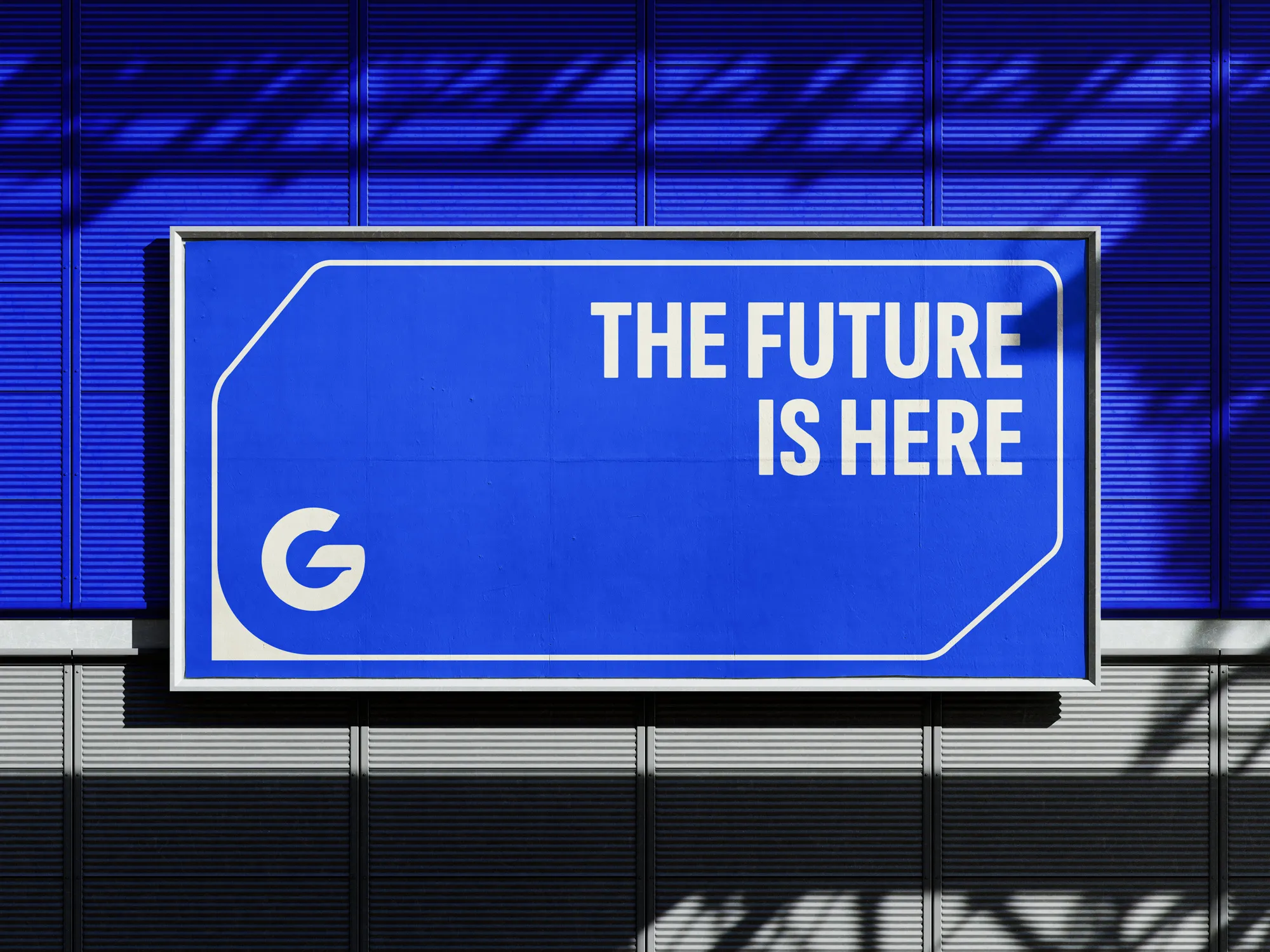
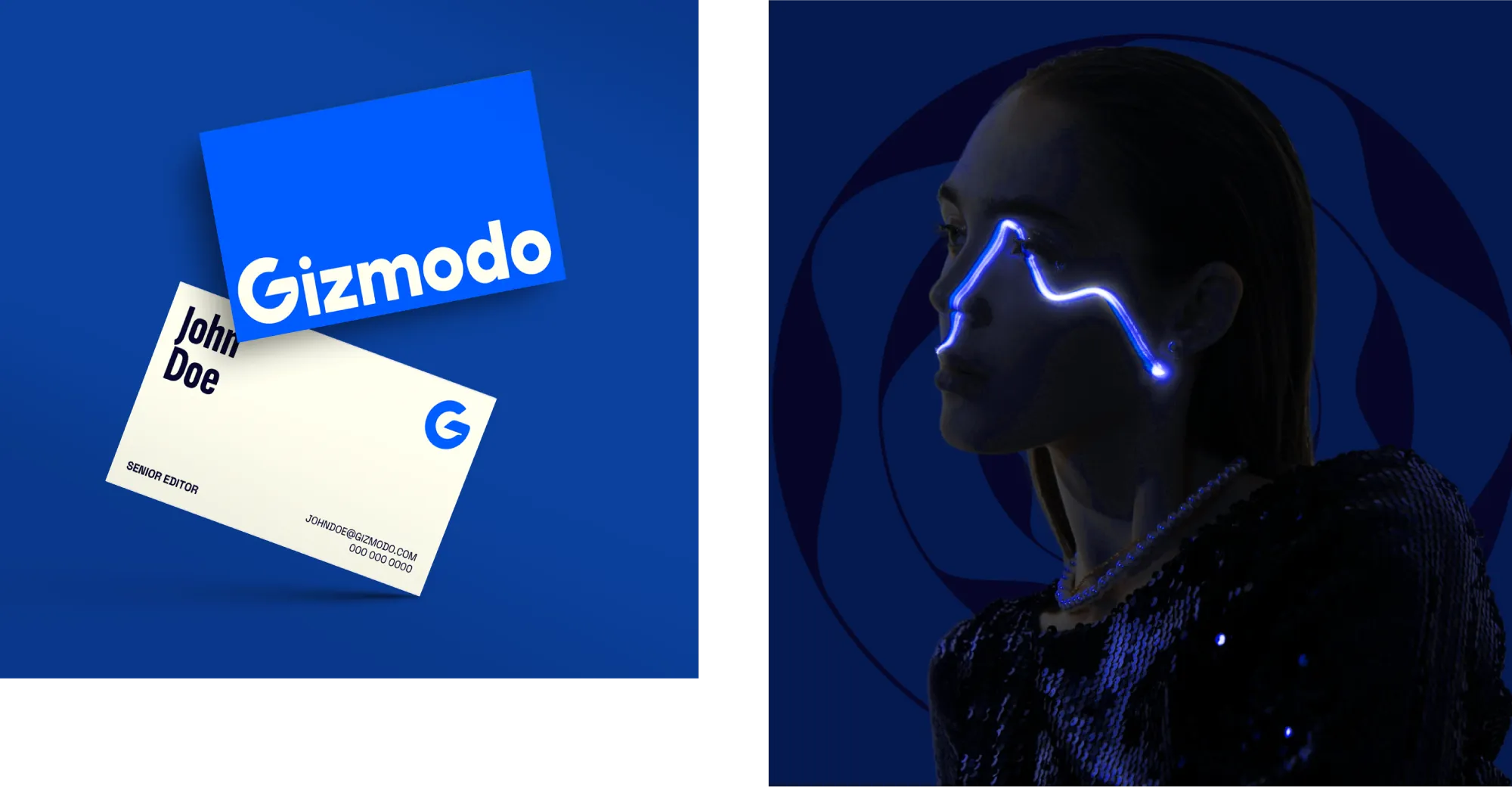
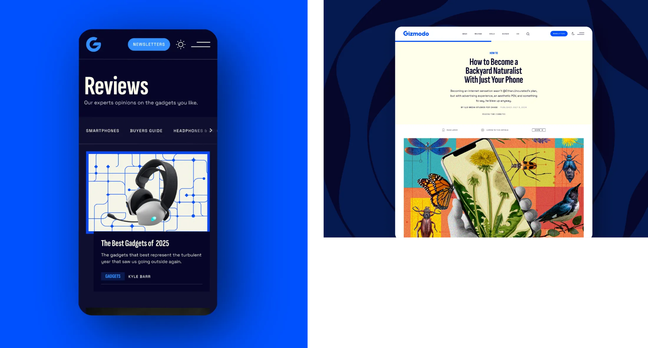
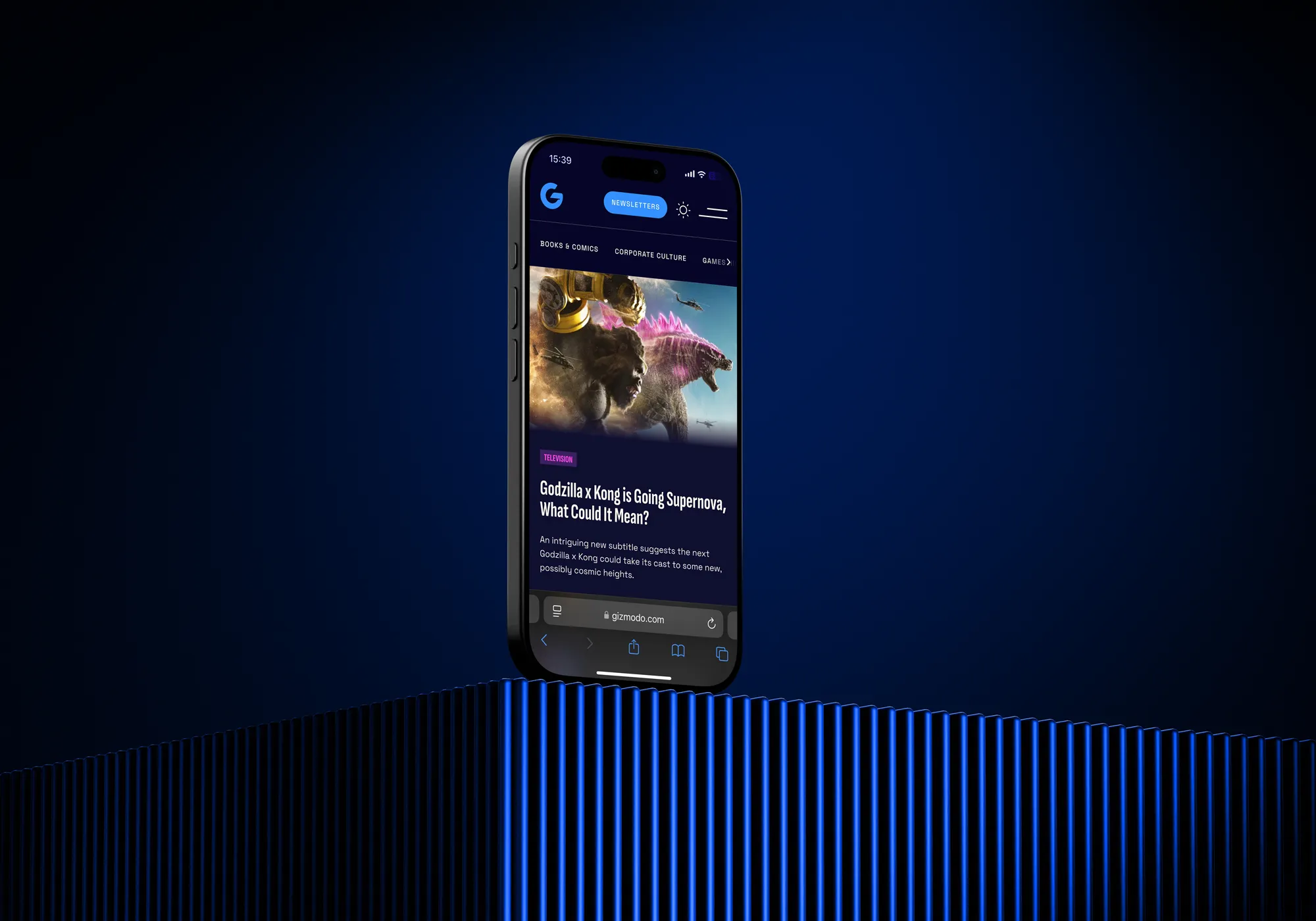
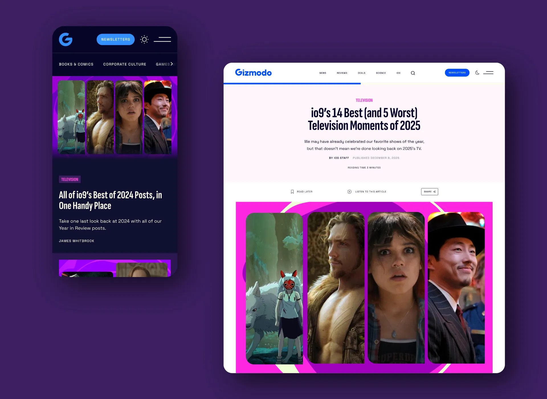
We reimagined Gizmodo’s digital presence with a refreshed visual identity and modern UI that honors the brand’s legacy while looking ahead. The redesign introduced a playful, tech-inspired visual world—balancing bold typography, vibrant accents, and intuitive layouts to create an engaging reader experience. Alongside Gizmodo, we also revamped io9 and Earther, extending the design system into a sister brand universe that feels distinct yet connected. The result is a cohesive, modern platform that speaks to Gizmodo’s authority in tech and culture, while energizing its audience with a fun and future-facing identity.
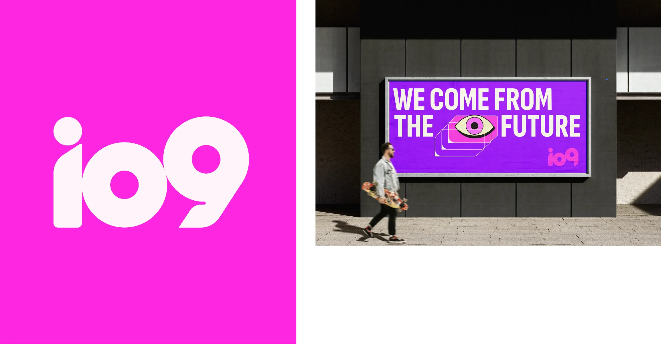
As part of the Gizmodo redesign, we extended the identity system to its sister brands, io9 and Earther. Both received refreshed logos that align with Gizmodo’s modernized visual language while preserving their individual character. The new marks create a cohesive brand family, ensuring consistency across the network while strengthening each title’s unique voice within the portfolio.
The identity came to life through a full UX and website redesign, complemented by a refreshed social media presence and a broader digital overhaul.